Chart anything together (G)
G puts any series (a price, a statement line, a multiple, an economic series or a formula) on one timeline so you can see whether they move together.
- 5 min
- 3 questions
- Lesson 5 of 5
Why you would care
"NVDA went up because revenue exploded." Did it? Price is one line, revenue is another. Until you see them on the same dates, the story is a guess.
Glets you draw both and look.
The idea from scratch
A series is a list of values with dates: daily closes, quarterly revenue, monthly inflation. Every chart in Gloom is one or more series on a shared time axis.
The trick is that series arrive at different speeds:
Prices
every trading day (or every minute).
Revenue and profit
once a quarter, when the company files its report.
Economic data
monthly or weekly, when it is published.
G lines them up by date. A quarterly number is placed at the date it was filed when that is known, and it stays flat until the next one arrives. So on any day you only see what was public on that day. This is called as-of alignment.
Revenue is the money a company takes in from sales. Net income is what is left after every cost and tax. Chapter 4 explains both properly; here you only need to know they are reported once a quarter.
How you name a series
You type SYMBOL:field:
| You type | You get |
|---|---|
NVDA:price | NVIDIA's price |
NVDA:revenue | NVIDIA's quarterly revenue |
NVDA:net_income | NVIDIA's quarterly net income |
Separate several with commas. Economic series (inflation, jobs, rates) have longer names: find them with CAT, described below, and press g to add them.
See it in Gloom
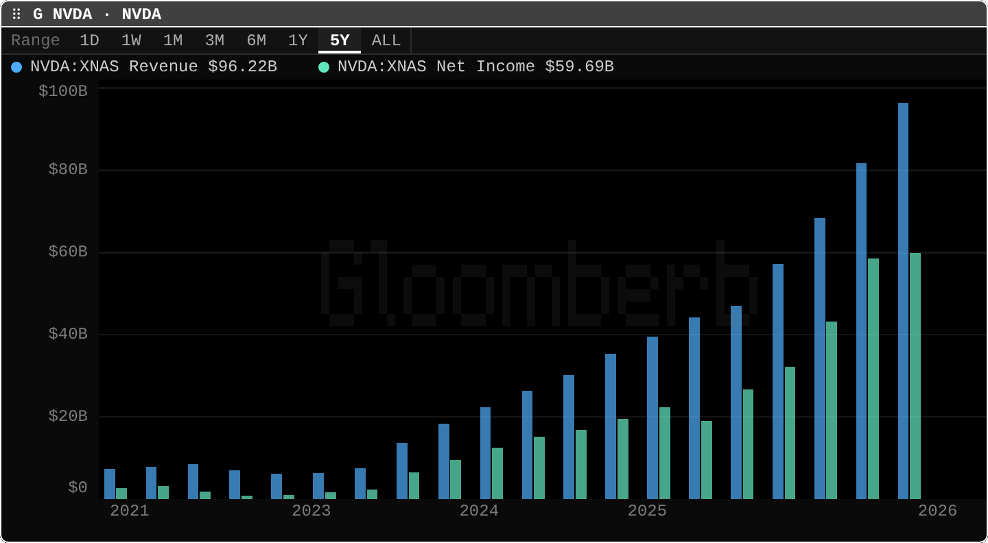
open ittype G NVDA:revenue, NVDA:net_income. Type G alone for an empty chart.
The tour:
- Title:
G NVDA · NVDA, one entry per series. - Range:
5Yselected. Same buttons as every chart. - Legend:
Revenue $96.22BandNet Income $59.69B, the latest quarter of each (NVIDIA's quarter ended 26 July 2026). Four quarters added together give the trailing-year totals you see inFA. - The columns: one pair per quarter. Flat around $5 to $8B a quarter from 2021 to early 2023, then a steep climb.
- The gap between the bars: net income is a large share of revenue in the later quarters. That ratio is the net margin (chapter 4).
Press s for Series: add, remove, reorder or hide series, and pick each one's style (candles, line, area, columns, steps), axis, panel and scale (linear or logarithmic). Press f for Formulas: the ratio of two series, their spread (one minus the other), or their rolling correlation.
GP, GIP, CMP, GF and GE are the same chart tool with different starting setups. G is the blank canvas.
Practice and recap
Try it3 tasks
- In the screenshot, find the first quarter where revenue passed $20B. Roughly when?
- Estimate net income divided by revenue for the latest quarter: $59.69B / $96.22B.
- Write the
Gcommand that would put AAPL's price and AAPL's revenue on one chart.
Common mistakes4 mistakes
- Reading a flat quarterly line as "nothing changed". It is flat because nothing new was reported until the next filing.
- Putting a $300 price and a $90B revenue on the same axis. Give one its own axis or panel in Series, or one line will look flat.
- Taking "both went up" as proof that one caused the other. Two rising lines can share a third cause, or none.
- Forgetting the units in the legend: B is billions, M millions.
Check yourself3 questions
- What is a series?
- Why does a revenue line move in steps on a daily chart?
- Which key opens the Formulas menu, and name one formula in it.
Answers
- A list of values with dates.
- Revenue is reported once a quarter, so it stays flat between filings.
f. Ratio, spread or rolling correlation.
Words in this lesson6 words
- series
- a list of values with dates
- as-of alignment
- placing each value at the date it became public, flat until the next one
- revenue
- the money a company takes in from sales
- net income
- what is left of revenue after every cost and tax
- ratio / spread
- one series divided by / minus another
- logarithmic scale
- an axis where equal steps mean equal percentage changes
Educational material about reading market data, not investment advice.