Seasonality (SEAS)
SEAS lays out a ticker's monthly returns year by year with each month's average, median and share of up years, and shows why calendar patterns are weak evidence.
- 4 min
- 3 questions
- Lesson 3 of 4
Why you would care
Does this usually go up in July? "September is the worst month for stocks." "Sell in May and go away." Market folklore is full of calendar claims.
SEASlets you check them in ten seconds. More importantly, it shows how little ten years of data can prove.
The idea from scratch
Seasonality is a pattern that repeats with the calendar: heating oil in winter, retail sales at Christmas, maybe stocks in some months.
SEAS builds a grid:
- one row per year, one column per month,
- each cell is that month's return (from the last close of the previous month to the last close of that month),
- summary rows on top: Avg (the average), Median (the middle value when sorted), and Up % (the share of years the month was positive).
Why the median matters
One wild year can drag an average far away. The median ignores how big the extremes were.
Why this is weak evidence
Ten years gives ten numbers per month. That is a small sample.
- If a stock rises in 60% of months, getting 8 or more up years out of 10 for some month happens fairly often by pure chance.
- With 12 months to look at, one of them will look "special" almost every time. Searching many patterns and keeping the best one is called data mining (or overfitting).
- A real seasonal effect needs a reason (a tax deadline, a weather cycle, a product calendar) and should survive in other periods and other markets.

See it in Gloom
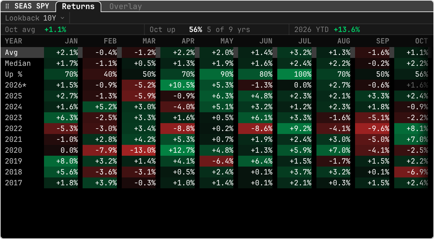
open ittype SEAS SPY. The Overlay tab lays each year's path over one January-to-December axis.
Lookback 10Y: how many years are in the grid.- Top strip:
Oct avg +1.1%,Oct up 56% 5 of 9 yrs,2026 YTD +13.6%. The current month's history, and the year to date. Avg,Median,Up %rows: July shows +3.2% average and100%up. September shows -1.6% average and 50% up.2026*: the star marks the current year, still in progress; the current month's cell is dim because it is not finished.- Colors: deeper green for bigger gains, deeper red for bigger losses. 2020's March (-13.0%) and April (+12.7%) stand out.
Practice and recap
Try it3 tasks
- In the grid, which month had the most red cells? (February: six red years out of ten, which is why its Up % is 40%.)
- Compute the July "100%" honestly: how many years is that? (Ten. Ten coin-like outcomes, not a law.)
- Compare average and median for September: -1.6% vs -0.2%. What does the gap tell you? (A few big down Septembers, like 2022's -9.6%, pull the average down.)
Common mistakes4 mistakes
- Trading a month because it was up 8 of the last 10 years.
- Using only the average. Look at the median and the up %.
- Forgetting that the current year is incomplete.
- Ignoring the bigger picture: in a strong decade, most months look good.
Check yourself3 questions
- What does "Up % 70%" mean?
- Why can the average and median of a month disagree?
- Name two checks before believing a seasonal pattern.
Answers
- The month was positive in 70% of the years in the lookback.
- Because one or two extreme years move the average but not the median.
- A real-world reason for it, and evidence that it holds in other periods or markets.
Words in this lesson7 words
- seasonality
- A pattern that repeats with the calendar.
- average (mean)
- Sum of values divided by their count.
- median
- The middle value once sorted; ignores how extreme the ends are.
- up % (hit rate)
- The share of periods with a positive return.
- small sample
- Too few observations to tell a pattern from luck.
- data mining (overfitting)
- Searching many patterns and keeping the one that looks best by chance.
- YTD
- Year to date: from the last close of last year to now.
Educational material about reading market data, not investment advice.