Reading a price chart (GP)
GP is the price chart: candles on top, volume below, a multi-year range by default.
- 4 min
- 3 questions
- Lesson 1 of 5
Why you would care
What has the price done, and how busy was trading while it did it? Someone says "AAPL has been on a tear". A chart turns that sentence into a shape you can check: when did the climb start, how steep, were there dips, and was the market busy or quiet during the climb?
The idea from scratch
A candle
Take one period, say one day. Four prices matter: the first trade (open), the highest (high), the lowest (low) and the last (close). A candle draws all four:
- The thick part, the body, runs from open to close.
- The thin lines above and below, the wicks, reach the high and the low.
- Colour: the close was above the open (price rose in the period) or below it (price fell). In the screenshot below, blue is up and red is down.
Illustrative: open $150, high $156, low $149, close $155. A blue body from 150 to 155, a wick up to 156 and a wick down to 149.
- High 156: top of the upper wick
- Close 155: top of the body
- Open 150: bottom of the body
- Low 149: bottom of the lower wick
Volume
Volume is the number of shares traded in the period. It is drawn as bars under the price. Tall bar, busy day. A big price move on heavy volume means many people took part; the same move on thin volume means fewer did.
Range and bar size
Two separate choices:
Range
how far back the chart looks (1D, 1W, 1M, 3M, 6M, 1Y, 5Y, ALL).
Interval (bar size)
how much time one candle covers.
Dis one day per candle,Wone week,Mone month.Autopicks a size that fits the range.
A 5-year chart with daily candles has about 1,250 candles, too many to see. So Auto uses weekly candles there.
See it in Gloom
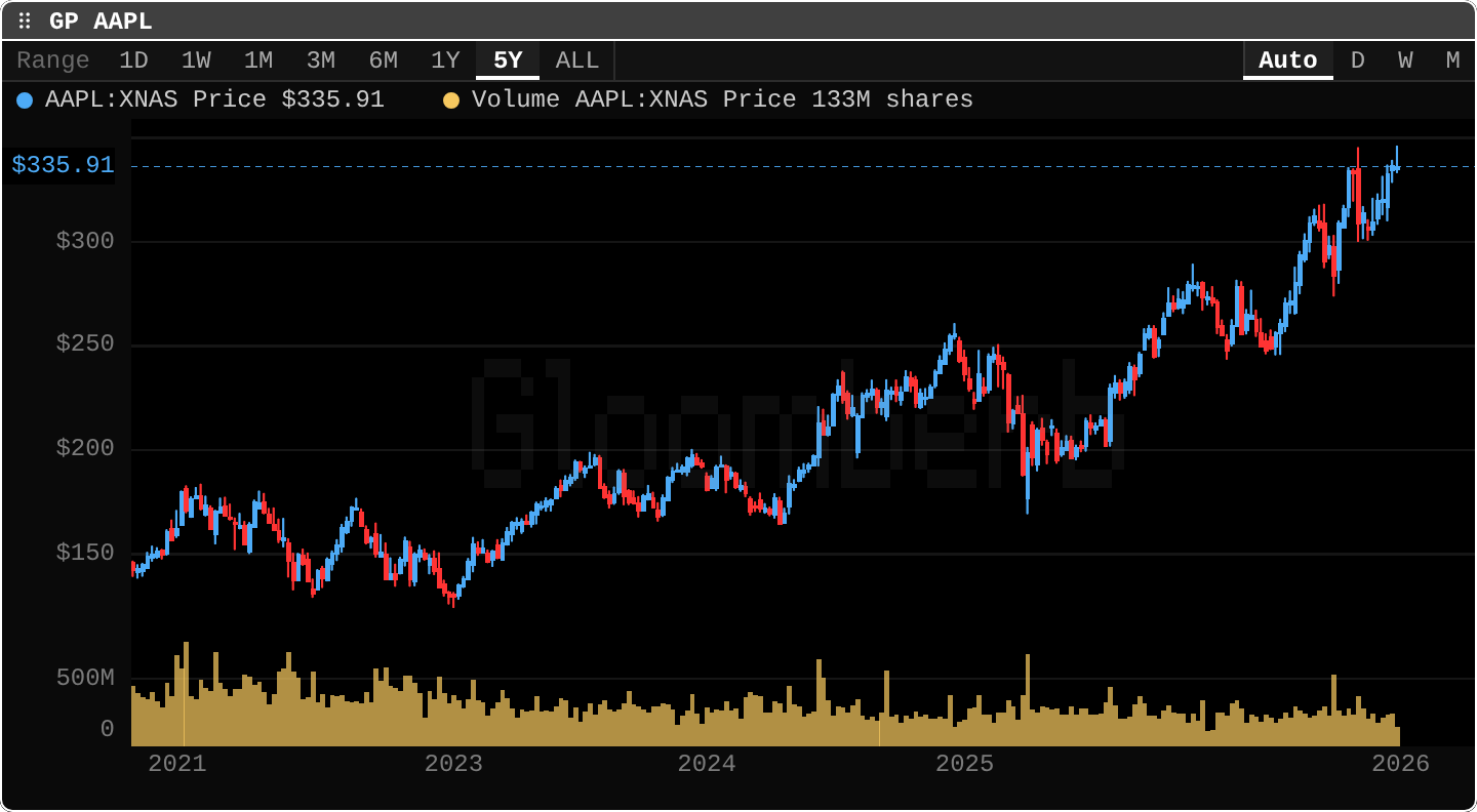
open ittype GP AAPL.
The tour:
- Range buttons, top left: 1D to ALL.
5Yis selected. - Interval buttons, top right:
Auto,D,W,M. Presstto open the interval picker. - Legend:
AAPL:XNAS Price $335.91andVolume ... 133M shares.XNASis the exchange code for Nasdaq. Click a legend entry to hide or show that series. - The candles. Red and blue bars. Notice the long climb from about $130 in early 2023 to $335.
- The dotted line at $335.91: the last price, so you can see where today sits against history.
- Volume at the bottom, in the same timeline. The tall spikes mark the busiest weeks.
Keys in the chart: s series, i indicators, t timeframe, f formulas. The next lessons use them.
Practice and recap
Try it3 tasks
- In the screenshot, find the lowest candle. Roughly what price and when? (Early 2023, near $125.)
- Find the tallest volume bar. Does it line up with a big move in price?
- Count how many times the price fell by about $50 and then recovered.
Common mistakes4 mistakes
- Comparing candle colours across apps. Gloom uses blue for up here; many charts use green. Read the legend, not the habit.
- Reading a 5Y chart with weekly candles as if each candle were a day.
- Judging a move without its volume.
- Forgetting a long chart hides short moves. A 10% dip can be invisible on a 5-year range.
Check yourself3 questions
- A candle has open $20, close $18. Did the price rise or fall in that period?
- On a 1-year range with
Auto, would you expect daily or monthly candles? - What does the dotted horizontal line show?
Answers
- It fell: close below open.
- Daily. About 250 candles fit; monthly would be only 12.
- The last price, extended across the chart.
Words in this lesson7 words
- open / high / low / close
- first, highest, lowest and last trade of a period
- candle
- a bar showing open, high, low and close for one period
- body / wick
- the thick open-to-close part / the thin lines to the high and low
- volume
- number of shares traded in the period
- range
- how far back the chart looks
- interval
- how much time one candle covers
- XNAS
- the exchange code for Nasdaq
Educational material about reading market data, not investment advice.