The market heatmap (HM)
HM draws the largest US stocks as rectangles sized by market value and colored by today's change.
- 3 min
- 3 questions
- Lesson 3 of 6
Why you would care
What is the whole market doing today, at a glance? An index can be flat while half its members rise and half fall. A heatmap shows that instantly, and shows which giant moved the index: when a company worth 5 trillion dollars falls 2%, it outweighs dozens of small winners. It is the screen people screenshot for "today in markets".
The idea from scratch
A heatmap (here a treemap) encodes two numbers per stock:
- Size of the rectangle = market capitalization (price x shares). Bigger companies get bigger boxes.
- Color = today's % change. Green up, red down; the intensity shows the size of the move. Grey means no change or no data.
Why size matters: in a cap-weighted index like the S&P 500, each company's influence equals its share of total market value.

See it in Gloom
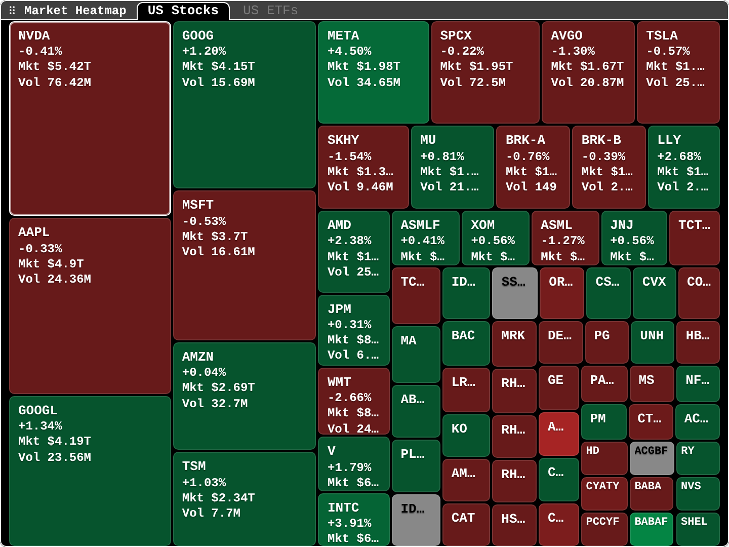
open ittype HM. Tabs: US Stocks, US ETFs. In newer versions (after 0.15.8) it can also map your own portfolio list.
NVDA -0.41% Mkt $5.42T Vol 76.42M: the largest box, slightly red.META +4.50%: the brightest green among the giants.WMT -2.66%: a clear red box.- Two boxes for Alphabet (
GOOG,GOOGL) and Berkshire (BRK-A,BRK-B): different share classes of one company. - Grey boxes: no change or no data for that name.
- Small boxes cut their labels (
TC…,ID…): hover or open them for details.
Practice and recap
Try it3 tasks
- In the screenshot, which of the five largest companies rose? (GOOG/GOOGL, and META among the next ones.)
- Why might the market fall when most boxes are green? (A few very large red boxes outweigh many small green ones.)
- Name two tickers that are share classes of the same company. (GOOG and GOOGL, or BRK-A and BRK-B.)
Common mistakes4 mistakes
- Counting boxes instead of weighting by size.
- Reading color intensity as volume; it is the size of the % move.
- Forgetting share classes and double counting a company.
- Treating a heatmap of a delayed feed as live.
Check yourself3 questions
- What does box size represent?
- What does box color represent?
- Why can one stock dominate the heatmap's story?
Answers
- Market capitalization.
- Today's percentage change.
- Because in a cap-weighted market the largest companies carry most of the weight.
Words in this lesson4 words
- heatmap (treemap)
- Rectangles sized by one value and colored by another.
- cap-weighted
- Each member counts in proportion to its market value.
- market capitalization
- Price x shares outstanding.
- share class
- One of several kinds of shares of the same company.
Educational material about reading market data, not investment advice.