Economic statistics (ECST)
ECST is a dashboard of the main US economic statistics (inflation, labor, growth, housing, rates), each with its latest value and a chart against its own history.
- 3 min
- 3 questions
- Lesson 2 of 4
Why you would care
Where does the economy stand, in context? The calendar tells you what came out today; the dashboard tells you what it means in context. Is 4.1% unemployment high? Is 3.4% inflation unusual? Only history answers that. It is the one-screen economic briefing before any market conversation.
The idea from scratch
A handful of statistics describe the economy (chapter 01, The macro machine):
| Group | Main statistics |
|---|---|
| Inflation | CPI and core CPI (consumer prices), PCE and core PCE (the Fed's preferred measure), PPI (producer prices) |
| Labor | Unemployment rate, payrolls (jobs added), weekly claims, job openings |
| Growth | Real GDP (after inflation), industrial production, capacity use, durable goods orders |
| Housing, rates | Home sales, starts, mortgage rates, yields |
Each is published on its own schedule (monthly, weekly, quarterly). Two ways to read them:
Change
m/m (month over month), q/q, y/y (chapter 01, The macro machine).
Level against history
is it near its record high or low, above or below its long-run average?
Seasonal adjustment removes regular calendar patterns (more retail hiring in December). Some series are shown "not seasonally adjusted"; compare them only with the same month in past years.
- Agencies publish statistics
- Dashboard: latest, previous, date
- Chart vs 5Y, 20Y or all history
- High, low, mean, target
- Reading: hot, cold or normal?
See it in Gloom
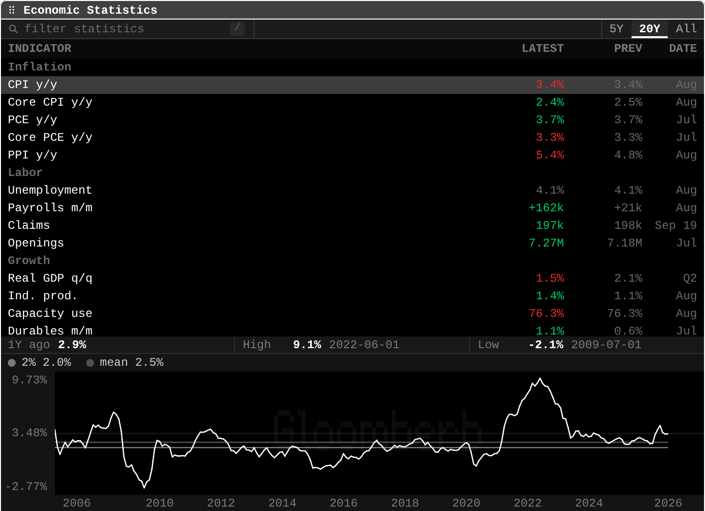
open ittype ECST. / filters statistics; 5Y, 20Y, All set the chart window. Select a row to chart it.
CPI y/y 3.4% prev 3.4% Aug: annual inflation, unchanged on the month. Red when it moved the "bad" way for the economy.PCE y/y 3.7%,Core PCE y/y 3.3%: the Fed's preferred gauges, above target.Unemployment 4.1%,Payrolls m/m +162k(prev +21k): jobs growth rebounded.Real GDP q/q 1.5%(prev 2.1%): growth slowed in Q2.- Chart strip:
1Y ago 2.9%,High 9.1% 2022-06-01,Low -2.1% 2009-07-01; lines at2%(target) andmean 2.5%.
Practice and recap
Try it3 tasks
- Is CPI above or below its 20-year mean? (Above: 3.4% vs 2.5%.)
- Which labor number is weekly? (Claims.)
- Payrolls went from +21k to +162k. Stronger or weaker labor market? (Stronger.)
Common mistakes4 mistakes
- Reading one month as a trend.
- Comparing a non-seasonally adjusted month with the previous month.
- Forgetting revisions: payrolls and GDP are revised, sometimes a lot.
- Mixing CPI and PCE: they measure prices differently.
Check yourself3 questions
- What is PCE, and why does it matter?
- Why compare a statistic with its own history?
- What does seasonal adjustment remove?
Answers
- The personal consumption expenditures price index, the Fed's preferred inflation measure.
- Because a level only means something next to its usual range and its target.
- Regular calendar patterns, like holiday hiring.
Words in this lesson6 words
- PCE
- The personal consumption expenditures price index.
- PPI
- The producer price index: prices businesses receive.
- payrolls
- Jobs added in a month.
- real GDP
- GDP after removing inflation.
- capacity use
- The share of factory capacity being used.
- seasonal adjustment
- Removing regular calendar patterns from a series.
Educational material about reading market data, not investment advice.